
The company had grown as far as it could from providing excellent products and services and relying on word of mouth. They were ready for a website that reflected their status as leaders in the industrial ozone space.
Design and apply new branding
Responsive, scalable
Improved SEO
CMS Capabilities
Icon, Illustration, photography, written copy
In this case, I spent roughly 20% of the time designing how the content flowed and collaborating with the client's marketing vp.
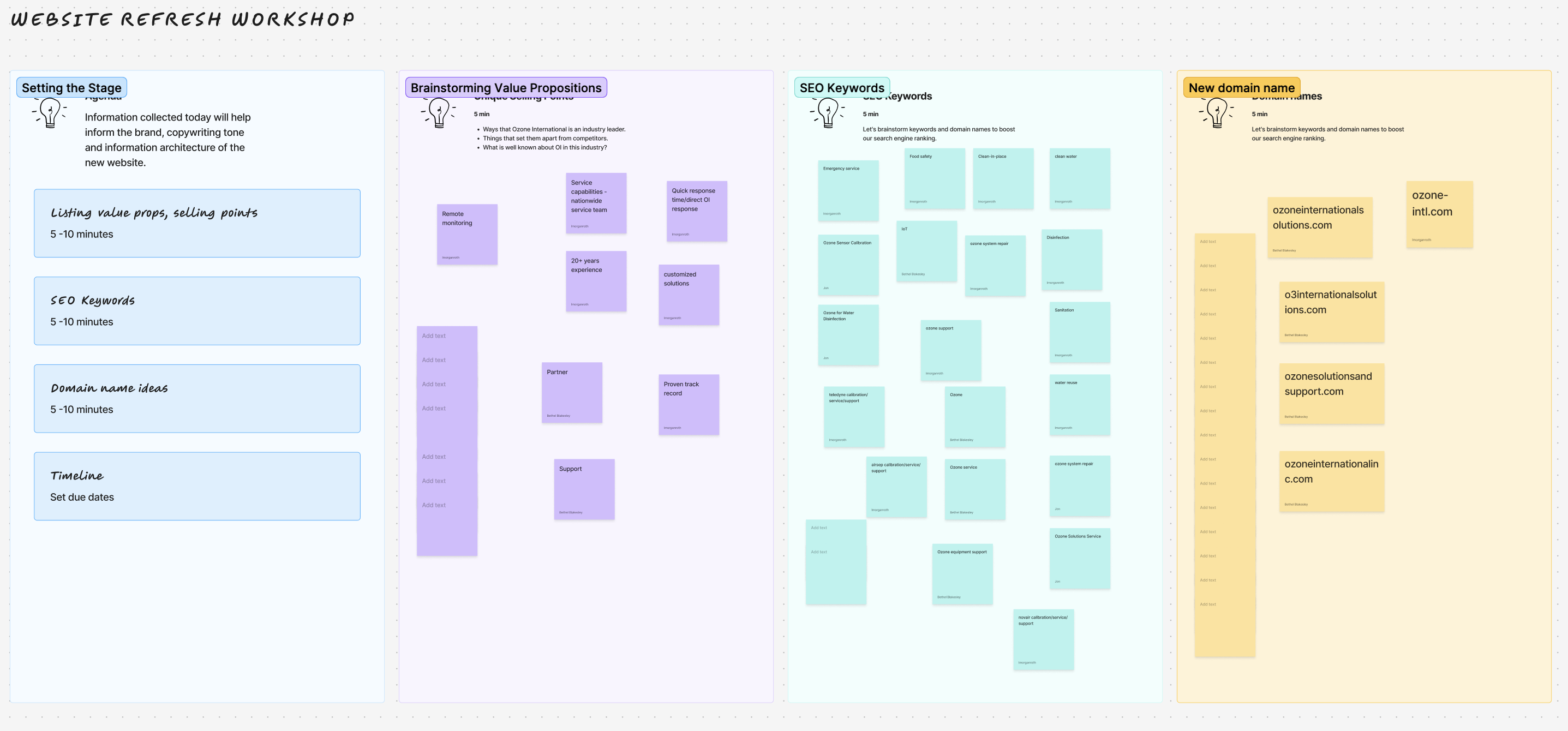
The first step was aligning on OI’s story and direction. Their original site was full of basic UX and UI issues, so the priority was understanding how they wanted to communicate who they are now, not just fixing pages. I led a short strategy workshop with the CEO, Marketing VP, and COO to clarify:
What sets OI apart from competitors
What content and structure are needed to tell that story
Foundation and design system for website
How blogs and case studies can support thought leadership + SEO
The "before" version of the site was basically an online presence but not an effective marketing website. We decided on a full redesign rather than a minor refresh.
Modernize, create better experience
Improve UI and accessibility, add CMS and blog feature for case studies
Design for cross referencing and SEO
Make more informative with fewer words, more graphics, better storytelling
In addition to the new website, the client needed brand guidelines to go with it, meaning the design of the site would also establish the color palette, photo and illustration styles, icon system and everything associated with the brand. Part of my process is to show early variations to spark dialogue. Seeing something that doesn’t resonate is often the fastest way to for clients to identify what they do want. These images represent ideas that were rejected in the process of the design. (annotated)
For the website: avoid the stock generic photo look for people.
The ozone molecule watermark was too similar to every other competitor in the ozone space, but could be used as a texture.
Landing page hero needed photography: Client liked service truck imagery as their company is well known in the industry for fast service.
We agreed this was too many words in the header.
We decided against using photos for value props at all.


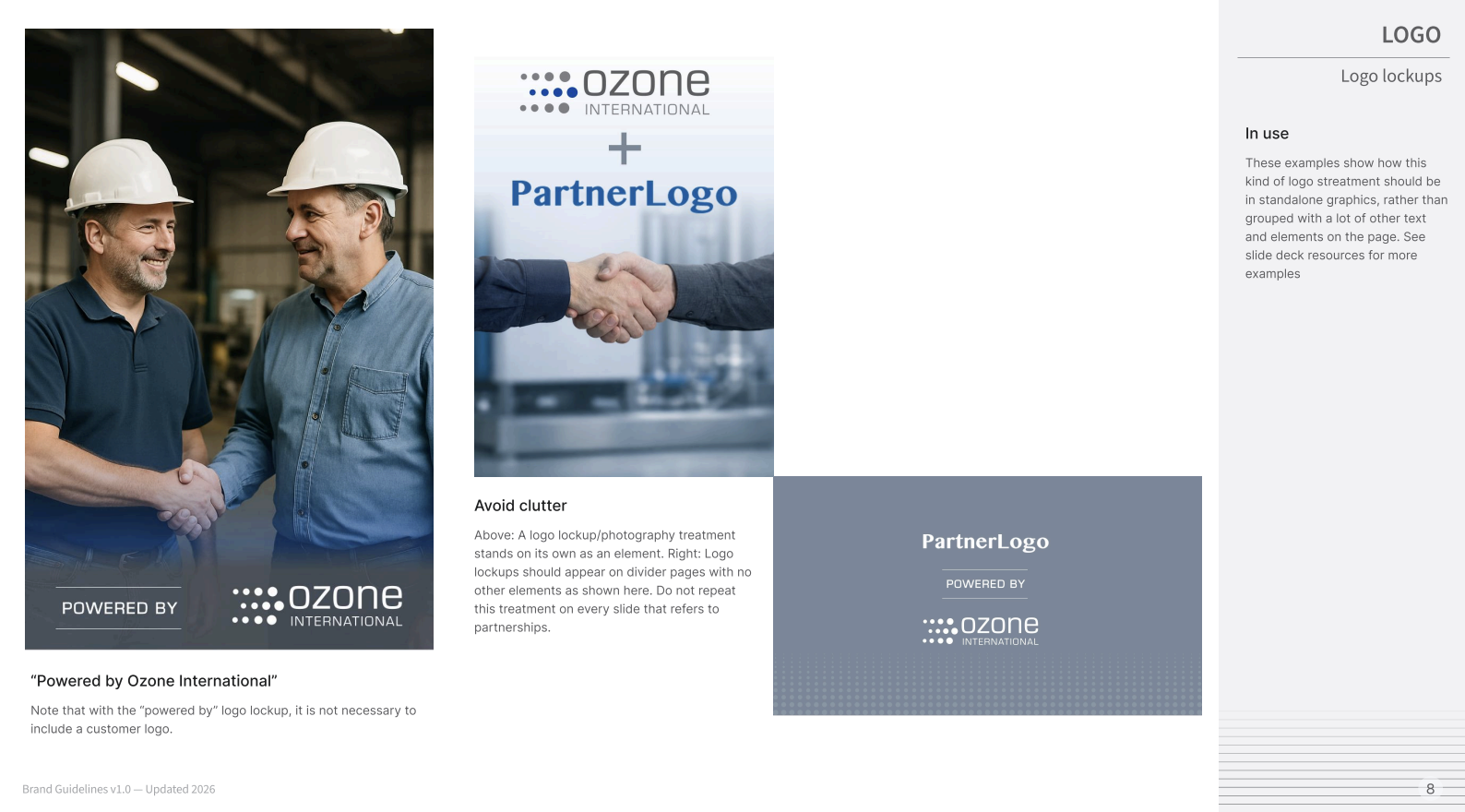
My process for this was client interview, followed by redesigning an existing slide deck to take inventory of all the types of elements they would need, followed by asking the client to evaluate and let me know if a) my assumptions are correct and b) if I am hitting the right styles, concept and vibe of the company. This was also an effective way to get a feel for what would work and not work for their brand guidelines. This is a page from the brand guide on using logo lockups, typically in their presentation decks. We settled on components, layouts and styles, rather than a prescriptive template, with just a few master slides.
The final iteration of the guidelines was based on design decisions made in collaboration with the client in the process of designing their website and slide deck template. See full artifact here.

The only thing not included in this phase of the site design was the blog template, to give the client more time to collect content. View the live website here.


B Blakesley ©2026